
2005年6月14日
最近在弄swing,需要由JComponent生成BufferedImage,在CSDN上发现一个好例子。下面是范例:
 Rectangle rect = comp.getBounds();
BufferedImage bufImage = new BufferedImage(rect.width,
rect.height,
BufferedImage.TYPE_INT_RGB);
Graphics g = bufImage.getGraphics();
g.translate(-rect.x, -rect.y);
comp.paint(g);这样,JComponent中的图像就保存到BufferedImage中了。
原文的链接:
http://dev.csdn.net/article/13/13531.shtm
posted @
2006-04-14 23:41 小米 阅读(1444) |
评论 (1) |
编辑 收藏
好久没有写blog了,距离上次写几乎已经是半年前的事情了。

这半年发生了不少事情。首先换了家公司,进了家金融企业,每天要西装革履的,一开始还真是不习惯。

这里开发是用的spring框架,以后要多研究研究spring的东西了。
第二件事就是和恋爱了三年的女友结婚了,从此两人长相厮守,不知道时间久了会不会审美疲劳。呵呵。

第三件事就是在深圳买了自己的小房子,虽然是小小的两房,不过我们已经很知足了。
而且刚好是赶在房价大涨前买的,还算走了点运气。换到现在,都不知道去哪里买好了。
在这里要向一些留言和发邮件给我的网友道歉,前段时间实在是太忙,没有空回复你们的信息和邮件。请原谅!
posted @
2006-03-29 19:43 小米 阅读(868) |
评论 (0) |
编辑 收藏
最近真是多事情忙,而且可能要忙到9月底。好久没有上来更新我的博客了,暂且发发牢骚。

posted @
2005-08-10 17:32 小米 阅读(1338) |
评论 (1) |
编辑 收藏
这一节是非常实用的一节,我在阅读此书的时候,一直在迷惑,究竟应该怎样管理Session呢?因为Session的管理是如此重要,类似于以前写程序对JDBC Connection的管理。看完此节后,终于找到了方法。
在各种Session管理方案中,ThreadLocal模式得到了大量使用。ThreadLocal是Java中一种较为特殊的线程绑定机制。通过ThreadLocal存取的数据,总是与当前线程相关,也就是说,JVM为每个运行的线程,绑定了私有的本定实例存取空间,从而为多线程环境经常出现的并发访问问题提供了一种隔离机制。
下面是Hibernate官方提供的一个ThreadLocal工具:
import net.sf.hibernate.*;
import net.sf.hibernate.cfg.*;
import org.apache.log4j.Logger;

 /**//**
 * <p>Title: </p>
*
* <p>Description: Session的管理类</p>
*
* <p>Copyright: Copyright (c) 2005</p>
*
* <p>Company: </p>
*
* @author George Hill
* @version 1.0
 */
*/
public class HibernateUtil  {
{
private static final Logger log = Logger.getLogger(HibernateUtil.class);
private static final SessionFactory sessionFactory;

 /**//**
* 初始化Hibernate配置
 */
*/
static {
try {
// Create the SessionFactory
sessionFactory = new Configuration().configure().buildSessionFactory();
} catch (Throwable ex) {
log.error("Initial SessionFactory creation failed.", ex);
throw new ExceptionInInitializerError(ex);
}
}
public static final ThreadLocal session = new ThreadLocal();
/**//**
* 根据当前线程获取相应的Session
* @return Session
* @throws HibernateException
*/
public static Session currentSession() throws HibernateException {
Session s = (Session) session.get();
// Open a new Session, if this Thread has none yet
if (s == null) {
s = sessionFactory.openSession();
session.set(s);
}
return s;
}
/**//**
* 返回Session给相应的线程
* @throws HibernateException
*/
public static void closeSession() throws HibernateException {
Session s = (Session) session.get();
session.set(null);
if (s != null)
s.close();
}
}
针对WEB程序,还可以利用Servlet2.3的Filter机制,轻松实现线程生命周期内的Session管理。下面是一个通过Filter进行Session管理的典型案例:
public class PersistenceFilter implements Filter {
protected static ThreadLocal hibernateHolder = new ThreadLocal();
public void doFilter(ServletRequest request, ServletResponse response, FilterChain chain) throws IOException, ServletException {
hibernateHolder.set(getSession());
try {
chain.doFilter(request, response);
} finally {
Session session = (Session) hibernateHolder.get();
if (session != null) {
hibernateHolder.set(null);
try {
session.close();
} catch (HibernateException ex) {
throw new ServletException(ex);
}
}
}
}
}
posted @
2005-07-29 19:43 小米 阅读(3988) |
评论 (1) |
编辑 收藏
数据分页显示,是很多B/S系统会遇到的问题。现在大多数主流数据库都提供了数据部分读取机制,而对于某些没有提供相应机制的数据而言,Hibernate也通过其它途径实现了分页,如通过Scrollable ResultSet,如果JDBC不支持Scrollable ResultSet,Hibernate也会自动通过ResultSet的next方法进行记录定位。Hibernate的Criteria、Query等接口提供了一致的方法设定分页范围。下面是书中的例子:
Criteria criteria = session.createCriteria(TUser.class);
Criteria.add(Expression.eq("age", "20"));
//从检索结果中获取第100条记录开始的20条记录
criteria.setFirstResult(100);
criteria.setFetchSize(20); 不过,我在测试的时候总是不能够正常工作,把setFetchSize方法换成setMaxResults方法才行。换成最新的mysql-connector-java-3.1.10-bin-g.jar驱动也是一样。
posted @
2005-07-26 18:12 小米 阅读(5609) |
评论 (4) |
编辑 收藏 Hibernate通过Lifecycle、Validatable接口制定了实体对象CRUD过程中的回调方式。
Lifecycle接口中的onSave、onUpdate、onDelete方法,如果返回true则意味着需要中止执行相应的操作过程。如果代码运行期间抛出了CallbackException,对应的操作也会被中止。注意,不要试图在这些方法中调用Session进行持久化操作,这些方法中Session无法正常使用。
Validatable.validate方法将在实体被持久化之前得到调用以对数据进行验证。此方法在实体对象的生命周期内可能被数次调用,因此,此方法仅用于数据本身的逻辑校验,而不要试图在此实现业务逻辑的验证。
Hibernate还引入了Interceptor,为持久化事件的捕获和处理提供了一个非侵略性的实现。Interceptor接口定义了Hibernate中的通用拦截机制。Session创建时即可指定加载相应的Interceptor,之后,此Session的持久化操作动作都将首先经由此拦截器捕获处理。简单的加载范例如下:
SessionFactory factory = config.buildSessionFactory();
Interceptor it = new MyInterceptor();
session = sessionFactory.openSession(it); 需要注意的是,与Lifecycle相同,Interceptor的方法中不可通过Session实例进行持久化操作。
posted @
2005-07-21 18:35 小米 阅读(3436) |
评论 (1) |
编辑 收藏
有兴趣的可以去参加看看,网址:
http://www.javachina.cn/Index.jsp
posted @
2005-07-20 14:55 小米 阅读(1059) |
评论 (2) |
编辑 收藏 最近真是忙,事情都挤到一块去了。 终于有时间又看了几页书。
言归正传,Hibernate中的Collection类型分为有序集和无序集两类。这里所谓的有序和无序,是针对Hibernate数据持久过程中,是否保持数据集合中的记录排列顺序加以区分的。无序集有Set,Bag,Map几种,有序集有List一种。有序集的数据在持久化过程中,会将集合中元素排列的先后顺序同时固化到数据库中,读取时也会返回一个具备同样排列顺序的数据集合。
Hibernate中的Collection类型是用的自己的实现,所以在程序中,不能够把接口强制转化成相应的JDK Collection的实现。
结果集的排序有两种方式:
1. Sort
Collection中的数据排序。
2. order-by
对数据库执行Select SQL时,由order by子句实现的数据排序方式。
需要注意的是,order-by特性在实现中借助了JDK 1.4中的新增集合类LinkedHashSet以及LinkedHashMap。因此,order-by特性只支持在1.4版本以上的JDK中运行。
posted @
2005-07-20 10:56 小米 阅读(4010) |
评论 (0) |
编辑 收藏
Session.get/load的区别:
1.如果未能发现符合条件的记录,get方法返回null,而load方法会抛出一个ObejctNotFoundException。
2.Load方法可返回实体的代理类类型,而get方法永远直接返回实体类。
3.Load方法可以充分利用内部缓存和二级缓存中现有数据,而get方法则仅仅在内部缓存中进行数据查找,如没有发现对应数据,将越过二级缓存,直接调用SQL完成数据读取。
Session.find/iterate的区别:
find方法将执行Select SQL从数据库中获得所有符合条件的记录并构造相应的实体对象,实体对象构建完毕之后,就将其纳入缓存。它对缓存只写不读,因此无法利用缓存。
iterate方法首先执行一条Select SQL以获得所有符合查询条件的数据id,随即,iterate方法首先在本地缓存中根据id查找对应的实体对象是否存在,如果缓存中已经存在对应的数据,则直接以此数据对象作为查询结果,如果没有找到,再执行相应的Select语句获得对应的库表记录(iterate方法如果执行了数据库读取操作并构建了完整的数据对象,也会将其查询结果纳入缓存)。
Query Cache产生作用的情况:
1.完全相同的Select SQL重复执行。
2.在两次查询之间,此Select SQL对应的库表没有发生过改变。
Session.save方法的执行步骤:
1.在Session内部缓存中寻找待保存对象。内部缓存命中,则认为此数据已经保存(执行过insert操作),实体对象已经处于Persistent状态,直接返回。
2.如果实体类实现了lifecycle接口,则调用待保存对象的onSave方法。
3.如果实体类实现了validatable接口,则调用其validate()方法。
4.调用对应拦截器的Interceptor.onSave方法(如果有的话)。
5.构造Insert SQL,并加以执行。
6.记录插入成功,user.id属性被设定为insert操作返回的新记录id值。
7.将user对象放入内部缓存。
8.最后,如果存在级联关系,对级联关系进行递归处理。
Session.update方法的执行步骤:
1.根据待更新实体对象的Key,在当前session的内部缓存中进行查找,如果发现,则认为当前实体对象已经处于Persistent状态,返回。
2.初始化实体对象的状态信息(作为之后脏数据检查的依据),并将其纳入内部缓存。注意这里Session.update方法本身并没有发送Update SQL完成数据更新操作,Update SQL将在之后的Session.flush方法中执行(Transaction.commit在真正提交数据库事务之前会调用Session.flush)。
Session.saveOrUpdate方法的执行步骤:
1.首先在Session内部缓存中进行查找,如果发现则直接返回。
2.执行实体类对应的Interceptor.isUnsaved方法(如果有的话),判断对象是否为未保存状态。
3.根据unsaved-value判断对象是否处于未保存状态。
4.如果对象未保存(Transient状态),则调用save方法保存对象。
5.如果对象为已保存(Detached状态),调用update方法将对象与Session重新关联。
posted @
2005-07-12 18:49 小米 阅读(4992) |
评论 (5) |
编辑 收藏
事务的4个基本特性(ACID):
1. Atomic(原子性):事务中包含的操作被看作一个逻辑单元,这个逻辑单元中的操作要么全部成功,要么全部失败。
2. Consistency(一致性):只有合法的数据可以被写入数据库,否则事务应该将其回滚到最初状态。
3. Isolation(隔离性):事务允许多个用户对同一个数据的并发访问,而不破坏数据的正确性和完整性。同时,并行事务的修改必须与其他并行事务的修改相互独立。
4. Durability(持久性):事务结束后,事务处理的结果必须能够得到固化。
数据库操作过程中可能出现的3种不确定情况:
1. 脏读取(Dirty Reads):一个事务读取了另一个并行事务未提交的数据。
2. 不可重复读取(Non-repeatable Reads):一个事务再次读取之前的数据时,得到的数据不一致,被另一个已提交的事务修改。
3. 虚读(Phantom Reads):一个事务重新执行一个查询,返回的记录中包含了因为其他最近提交的事务而产生的新记录。
标准SQL规范中,为了避免上面3种情况的出现,定义了4个事务隔离等级:
1. Read Uncommitted:最低等级的事务隔离,仅仅保证了读取过程中不会读取到非法数据。上诉3种不确定情况均有可能发生。
2. Read Committed:大多数主流数据库的默认事务等级,保证了一个事务不会读到另一个并行事务已修改但未提交的数据,避免了“脏读取”。该级别适用于大多数系统。
3. Repeatable Read:保证了一个事务不会修改已经由另一个事务读取但未提交(回滚)的数据。避免了“脏读取”和“不可重复读取”的情况,但是带来了更多的性能损失。
4. Serializable:最高等级的事务隔离,上面3种不确定情况都将被规避。这个级别将模拟事务的串行执行。
Hibernate将事务管理委托给底层的JDBC或者JTA,默认是基于JDBC Transaction的。
Hibernate支持“悲观锁(Pessimistic Locking)”和“乐观锁(Optimistic Locking)”。
悲观锁对数据被外界修改持保守态度,因此,在整个数据处理过程中,将数据处于锁定状态。悲观锁的实现,往往依靠数据库提供的锁机制。Hibernate通过使用数据库的for update子句实现了悲观锁机制。Hibernate的加锁模式有:
1. LockMode.NONE:无锁机制
2. LockMode.WRITE:Hibernate在Insert和Update记录的时候会自动获取
3. LockMode.READ:Hibernate在读取记录的时候会自动获取
4. LockMode.UPGRADE:利用数据库的for update子句加锁
5. LockMode.UPGRADE_NOWAIT:Oracle的特定实现,利用Oracle的for update nowait子句实现加锁
乐观锁大多是基于数据版本(Version)记录机制实现。Hibernate在其数据访问引擎中内置了乐观锁实现,可以通过class描述符的optimistic-lock属性结合version描述符指定。optimistic-lock属性有如下可选取值:
1. none:无乐观锁
2. version:通过版本机制实现乐观锁
3. dirty:通过检查发生变动过的属性实现乐观锁
4. all:通过检查所有属性实现乐观锁
posted @
2005-07-08 16:19 小米 阅读(4907) |
评论 (4) |
编辑 收藏 现在搜狐新闻上报道已经有700多人伤亡,这是自从911事件以后最大的一次恐怖袭击了。现在这个世界,是越来越不太平了,贫富差距的加大使得恐怖活动有生存的土壤。
不知道世界的经济会不会随着这次恐怖袭击而开始走向萧条。现在的地球越来越像一个村,发生在任何一个角落的事情,都有可能会影响到每一个人。
posted @
2005-07-08 10:50 小米 阅读(690) |
评论 (0) |
编辑 收藏
昨晚偶然看见国际台播放星战的作者乔治卢卡斯荣获AFI终身成就奖的颁奖典礼,耐心的看完了整个颁奖典礼。乔治在发表致词的时候,说自己很高兴能够从事自己喜欢的电影工作,如果不拍摄电影,都不知道自己还能够做什么。拍电影已经成了乔治生命的一部分。
看到荧屏上全世界的老人,中年人,年轻人,孩子说着:“Thank you! George.”可以看到乔治的眼睛朦胧。我心中真是感慨,每个人都有自己的梦想,能够从事自己喜欢的事情,确实是很开心的一件事。而自己所做的工作,能够给自己带来快乐,能够给人们带来快乐,这样的工作才值得用一生的时间去从事。
每一个登山者都有着自己心目中最想登上的山顶,能够登上这个山顶,前面付出的艰辛都是值得的。人生不也如此么?找到自己喜欢从事的事情,用自己毕生的精力去做这件事。
posted @
2005-07-07 12:00 小米 阅读(717) |
评论 (0) |
编辑 收藏
| 献出一份爱心 共同援助重病程序员王俊 |
| (2005.06.27) 来自:BJUG |
|
|
|
posted @
2005-07-04 18:48 小米 阅读(1812) |
评论 (22) |
编辑 收藏
摘要: 要将BufferedImage实例保存为BMP文件,就需要知道BMP文件的格式,可以参考我转载的文章:《BMP文件格式》。 下面是我的将BufferedImage实例保存为24位色BMP文件的实现。 ...
阅读全文
posted @
2005-07-04 17:33 小米 阅读(3505) |
评论 (6) |
编辑 收藏
在公元2005年6月27日,我做出了一个重大的决定,买房!花了自己至今为止都没有见过的那么多的钱买了一个小小的2房2厅,
从此变成了“负翁”。
不过,从此以后再也不用去租房,再也不用帮别人供房,再也不用一年搬一次家。深圳租房实在太贵,莲花北的一个小小的二房都要1800,有点装修就叫豪华装修,就是一个空荡荡的房子也开口要1500,太夸张了。住农民房又极度不安全,不想拿自己的生命开玩笑。
从此就变成月供一族了,

,不过,有了压力才有动力。为了自己的将来,自己的理想,努力奋斗!
9月26日是入伙的日子,好期待那天的到来啊。

posted @
2005-06-29 09:47 小米 阅读(995) |
评论 (9) |
编辑 收藏
一般而言,ORM的数据缓存应包含如下几个层次:
1. 事务级缓存(Transcation Layer Cache)
2. 应用级/进程级缓存(Application/Process Layer Cache)
3. 分布式缓存(Cluster Layer Cache)
Hibernate数据缓存(Cache)分为两个层次,以Hibernate语义加以区分,可分为:
1. 内部缓存(Session Level,也称为一级缓存)
2. 二级缓存(SessionFactory Level,也称为二级缓存)
Hibernate中,缓存将在以下情况中发挥作用:
1. 通过id[主键]加载数据时
2. 延迟加载
内部缓存正常情况下由Hibernate自动维护,如果需要手动干预,可以通过以下方法完成:
1. Session.evict
将某个特定对象从内部缓存清除。
2. Session.clear
清空内部缓存。
在Hibernate中,二级缓存涵盖了应用级缓存和分布式缓存领域。如果数据满足以下条件,则可将其纳入缓存管理。
1. 数据不会被第三方应用修改;
2. 数据大小(Data Size)在可接收的范围之内;
3. 数据更新频率较低;
4. 同一数据可能会被系统频繁引用;
5. 非关键数据(关键数据,如金融帐户数据)。
Hibernate本身并未提供二级缓存的产品化实现,而是为众多的第三方缓存组件提供了接入接口,较常用的第三方组件有:
1. JCS
2. EHCache
3. OSCache
4. JBossCache
5. SwarmCache
Hibernate中启用二级缓存,需要在hibernate.cfg.xml配置hibernate.cache.provider_class参数,之后,需要在映射文件中指定各个映射实体(以及collection)的缓存同步策略。Hibernate提供了一下4种内置的缓存同步策略:
1. read-only
只读。对于不会发生改变的数据,可使用只读型缓存。
2. nonstrict-read-write
如果程序对并发访问下的数据同步要求不是非常严格,且数据更新操作频率较低,可以采用本选项,获得较好的性能。
3. read-write
严格可读写缓存。基于时间戳判定机制,实现了“read committed”事务隔离等级。可用于对数据同步要求严格的情况,但不支持分布式缓存。这也是实际应用中使用最多的同步策略。
4. transactional
事务型缓存,必须运行在JTA事务环境中。
posted @
2005-06-22 18:15 小米 阅读(6202) |
评论 (5) |
编辑 收藏 在Java语言中,对象之间的比较可以通过引用比较(==)和内容比较(equals)两种方式进行,而在Hibernate的实体对象的比较是通过主键值来比较,如果要实现自己的识别逻辑,则需要重写equals方法和hashCode方法。
检查数据对象改变检查的一般策略有下面两种:
1. 数据对象监控
数据对象监控的实现方式,通过拦截器对数据对象的设值方法进行拦截。一旦数据对象的设置方法被调用,则将其标志为“待更新”状态,之后在数据库操作时将其更新到对应的库表。
2. 数据版本对比
在持久层框架中维持数据对象的最近读取版本,当数据提交时将提交数据与此版本进行比对,如果发生变化则将其同步到数据库对应的库表。
Hibernate采取的是第二种检查策略。它采用一个内部数据结构"EntityEntry"保存对应实体类的状态信息。
对于级联对象的更新,Hibernate将根据unsaved-value进行判定。首先Hibernate会取出目标对象的id。之后,将此值与unsaved-value进行比对,如果相等,则认为目标对象尚未保存,否则,认为对象已经保存,无需再进行保存操作。
posted @
2005-06-22 16:32 小米 阅读(5203) |
评论 (4) |
编辑 收藏
最近正在研读《深入浅出Hibernate》一书,前面写的随笔有些也是读该书的笔记,只是未做归类,从这篇开始,我将把相关的内容都整理成一个系列的读书笔记。
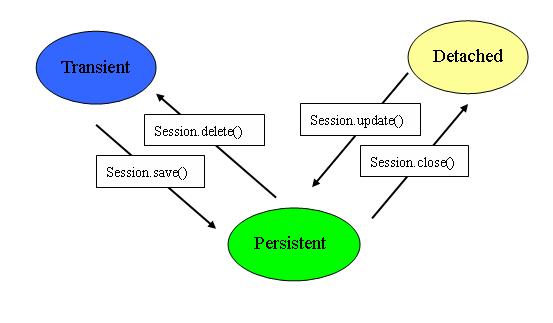
今天这篇是有关实体对象的生命周期。我刚开始接触Hibernate的时候,只是简单的把它当做一个API工具,直到后来看到有关VO和PO的内容时,才意识到Hibernate不仅仅是一个O/R Mapping的API工具,它还是一个容器。它可以帮你管理实体对象的生命周期。
实体对象的生命周期有三种状态:
1.Transient(自由状态)
此时的实体对象和数据库中的记录无关联,只是一个普通的JavaBean。
2.Persistent(持久状态)
此时的实体对象和数据库中的记录有关联,其变更将由Hibernate固化到数据库中。该实体对象处于由Hibernate框架所管理的状态。
3.Detached(游离状态)
处于Persistent状态的对象,其对应的Session实例关闭之后,那么,此对象就处于"Detached"状态。Detached状态和Transient状态的区别在于Detached状态的对象可以再次与某个Session实例相关联而成为Persistent对象。
从实体对象是否被纳入Hibernate实体管理容器的角度,Transient和Detached状态的实体对象可以统称为VO(Value Object),而被管理的实体对象称为PO(Persistent Object)。两者的区别:
1.VO是相对独立的实体对象,处于非管理状态。
2.PO是Hibernate纳入其实体管理容器(Entity Map)的对象,它代表了与数据库中某条记录对应的Hibernate实体,PO的变化在事务提交时将反映到实际数据库中。
3.如果一个PO与其对应的Session实例分离,那么此时,它又会变成一个VO。
下图是我画的实体对象生命周期的状态转换图:
posted @
2005-06-16 18:31 小米 阅读(3143) |
评论 (9) |
编辑 收藏
在使用HQL查询中,有时并不需要获取完整的一个实体对象,例如一个实体对象User有三个属性:account, password和email,如果我们只需要获取account和email属性,那么有两种方法可以选择。
1. 用普通的"select user.account, user.email from User as user",程序片断如下:
List list = session.createQuery("select user.account, user.email from User as user").list();
Iterator it = list.iterator();
while (it.hasNext()) {
Object[] values = (Object[]) it.next();
System.out.println(values[0] + " " + values[1]);
} 这时调用Query类的list方法返回的将是一个每个元素都是一个Object数组的List。如果只获取一个属性,那么返回的List中的每个元素都是String实例。
2.在HQL中用new操作符生成实体对象,例如:"select new User(user.account, user.email) from User as user",程序片断如下:
List list = session.createQuery("select new User(user.account, user.email) from User as user").list();
Iterator it = list.iterator();
while (it.hasNext()) {
User user = (User) it.next();
System.out.println(user.getAccount() + " " + user.getEmail());
} 这时list方法返回的List中的每一个元素都是User实体对象。这里有三点需要注意的:
a.在HQL语句中需要使用as操作符指定User的别名,并且需要在构造函数的属性前面加上别名;
b.HQL语句中的构造函数在User类中必须要有相应的构造函数;
c.生成的实体对象是VO对象,如果对这些对象调用Session的saveOrUpdate方法将导致插入新的记录,而不是更新记录。
posted @
2005-06-15 16:33 小米 阅读(3043) |
评论 (0) |
编辑 收藏
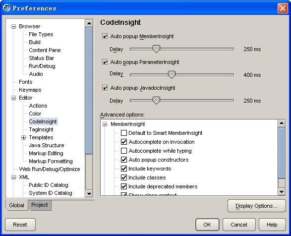
JBuilder 2005中多了一个Smart MemberInsight功能,这个功能会智能的匹配需要调用的方法或者获取的属性。例如有一个赋值操作,左边是一个List,右边是用一个方法获取值,那么当输入"."时,JBuilder 2005会自动的找到所有返回的值为List的方法。
不过,这实在是一个不怎么讨好的方法。因为很多时候并不是只有一层方法调用的,例如,当需要用一个方法获取一个实例,然后再用这个实例的方法获取需要的值时,这个功能就显得很碍手了。
终于,我还是决定关闭这个“智能”的功能。打开"Tools"——>"Preferences",在"Editor"的子项"CodeInsight"里,展开"MemberInsight",把"Default to Smart MemberInsight"这一项去掉。如下图所示:
posted @
2005-06-15 16:02 小米 阅读(551) |
评论 (0) |
编辑 收藏
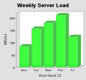
这个范例说明如何用JFreeChart画简单的柱状图,下面是一个JSP的简单范例:
<%@ page contentType="text/html; charset=GB2312" %>
<%@ page import="java.awt.*, java.text.*, java.util.*" %>
<%@ page import="org.jfree.chart.*" %>
<%@ page import="org.jfree.chart.axis.*" %>
<%@ page import="org.jfree.chart.labels.StandardCategoryItemLabelGenerator" %>
<%@ page import="org.jfree.chart.plot.*" %>
<%@ page import="org.jfree.chart.renderer.*" %>
<%@ page import="org.jfree.chart.servlet.ServletUtilities" %>
<%@ page import="org.jfree.data.DefaultCategoryDataset" %>
<%@ page import="org.jfree.ui.TextAnchor" %>
<%
//The data for the bar chart
double[] data = {85, 156, 179.5, 211, 123};
//The labels for the bar chart
String[] labels = {"Mon", "Tue", "Wed", "Thu", "Fri"};
DefaultCategoryDataset dataset = new DefaultCategoryDataset();
for (int i = 0; i < data.length; i++) {
dataset.addValue(data[i], null, labels[i]);
}
JFreeChart chart = ChartFactory.createBarChart3D("Weekly Server Load", "Work Week 25", "MBytes", dataset, PlotOrientation.VERTICAL, false, false, false);
chart.setBackgroundPaint(new Color(0xE1E1E1));
CategoryPlot plot = chart.getCategoryPlot();
// 设置Y轴显示整数
NumberAxis rangeAxis = (NumberAxis) plot.getRangeAxis();
rangeAxis.setStandardTickUnits(NumberAxis.createIntegerTickUnits());
CategoryAxis domainAxis = plot.getDomainAxis();
//设置距离图片左端距离
domainAxis.setLowerMargin(0.05);
BarRenderer3D renderer = new BarRenderer3D();
//设置柱的颜色
renderer.setSeriesPaint(0, new Color(0xff00));
plot.setRenderer(renderer);
String filename = ServletUtilities.saveChartAsPNG(chart, 300, 280, null, session);
String graphURL = request.getContextPath() + "/displayChart?filename=" + filename;
%>
<html>
<body topmargin="5" leftmargin="5" rightmargin="0">
<div style="font-size:18pt; font-family:verdana; font-weight:bold">
3D Bar Chart
</div>
<br>
<img src="<%= graphURL %>" border=0>
</body>
</html>
画出来的图:
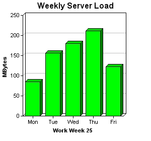
和ChartDirector画出来的图做一个比较:
posted @
2005-06-14 18:40 小米 阅读(10738) |
评论 (7) |
编辑 收藏
以前一直是用JFreeChart画统计图的,不过JFreeChart画出来的图形不够精细,看起来有些模糊,今天在网上看到另外一个工具ChartDirector,这是一个商业版本的工具,不过也可以免费使用,只是在画出来的图形下面都有一条它的广告条。
下面是它的一个柱状图的例子:
范例程序:
<%@page import="ChartDirector.*" %>
<%
//The data for the bar chart
double[] data = {85, 156, 179.5, 211, 123};
//The labels for the bar chart
String[] labels = {"Mon", "Tue", "Wed", "Thu", "Fri"};
//Create a XYChart object of size 300 x 280 pixels
XYChart c = new XYChart(300, 280);
//Set the plotarea at (45, 30) and of size 200 x 200 pixels
c.setPlotArea(45, 30, 200, 200);
//Add a title to the chart
c.addTitle("Weekly Server Load");
//Add a title to the y axis
c.yAxis().setTitle("MBytes");
//Add a title to the x axis
c.xAxis().setTitle("Work Week 25");
//Add a bar chart layer with green (0x00ff00) bars using the given data
c.addBarLayer(data, 0xff00).set3D();
//Set the labels on the x axis.
c.xAxis().setLabels(labels);
//output the chart
String chart1URL = c.makeSession(request, "chart1");
//include tool tip for the chart
String imageMap1 = c.getHTMLImageMap("", "", "title='{xLabel}: {value} MBytes'")
;
%>
<html>
<body topmargin="5" leftmargin="5" rightmargin="0">
<div style="font-size:18pt; font-family:verdana; font-weight:bold">
3D Bar Chart
</div>
<hr color="#000080">
<a href="viewsource.jsp?file=<%=request.getServletPath()%>">
<font size="2" face="Verdana">View Chart Source Code</font>
</a>
</div>
<br>
<img src='<%=response.encodeURL("getchart.jsp?"+chart1URL)%>'
usemap="#map1" border="0">
<map name="map1"><%=imageMap1%></map>
</body>
</html>
如果要在柱的顶部显示数值,可以调用Layer的setDataLabelFormat方法设置,范例:layer.setDataLabelFormat("{value}");
其它的例子可以参考它的文档的说明。ChartDirector的网址:http://www.advsofteng.com
posted @
2005-06-14 17:46 小米 阅读(5291) |
评论 (5) |
编辑 收藏